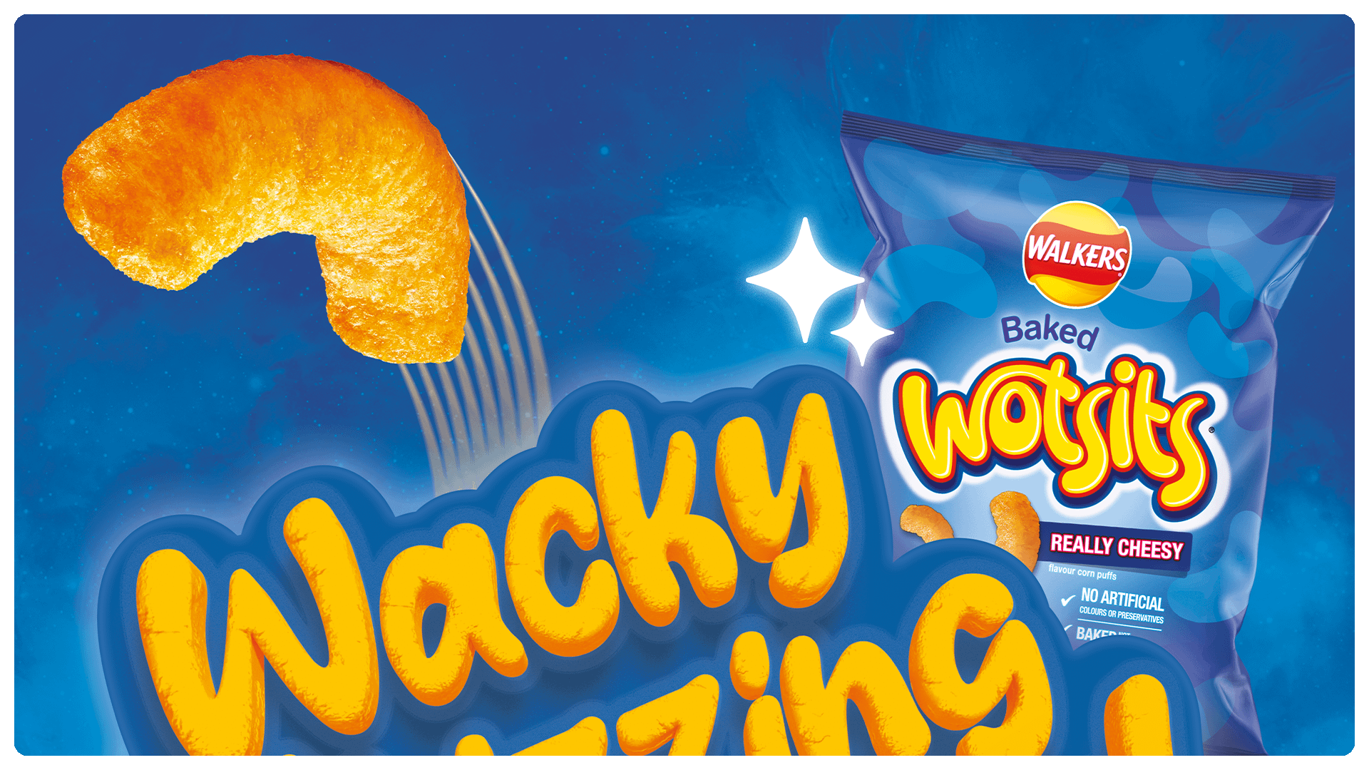
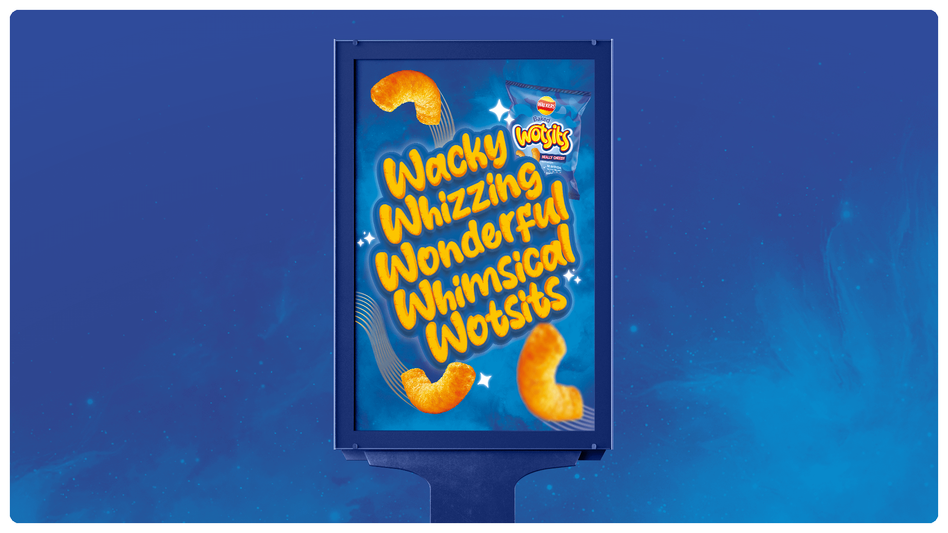
Whimsical Wotsits – Embarking on the creative journey to rejuvenate and modernise ‘Wotsits’ key visuals was an exhilarating endeavour that aimed to infuse the brand with the same playfulness and excitement found in every bite of this iconic snack. Wotsits, known for their irresistibly cheesy flavour, were seeking a fresh visual identity to reconnect with families and highlight their position as the tastiest and joyous snack in the nation.
During the project I applied the following processes:
- Brand & Product History
- Category Analysis
- Shopper Behaviours
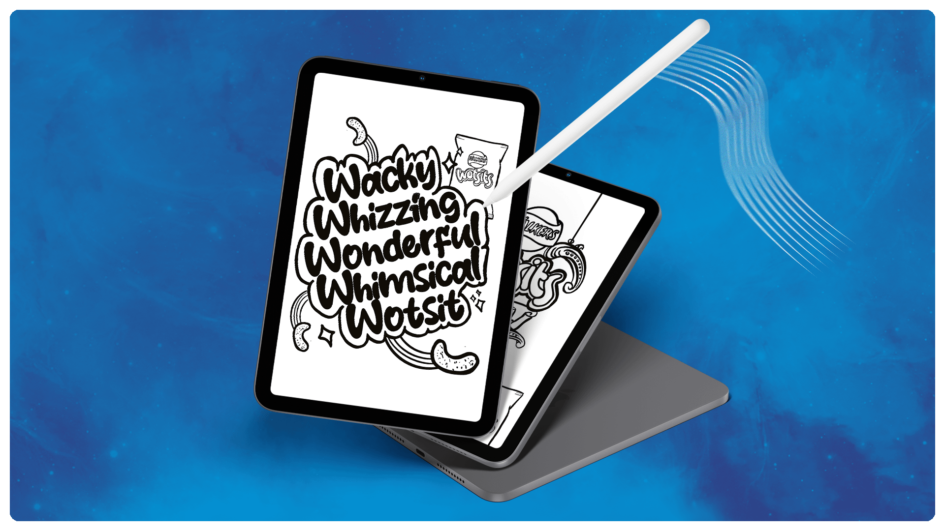
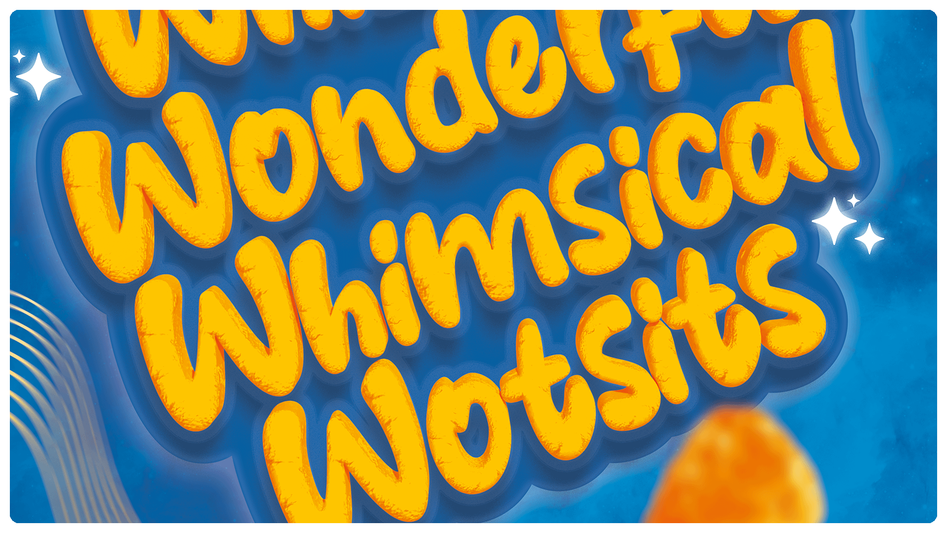
- Typography
- Creative Formatting
Brand Analysis
During the project I delved into the cheesy depths of Wotsits and identified three key areas to focus on. Also I collaborated with a strategist to build the foundations of my conceptual thinking and principles for my designs of the rejuvenation of the Wotsits Key Visual.
Journey to the Wacky, Whizzing, Wonderful World of Whimsical Wotsits
In the cosmic landscape of snack options, where mundane flavours often dominate, we sought to launch Wotsits into a new orbit of imagination, taking snacker cheese cravings through the stratosphere. The concept behind the “Wacky, Whizzing, Wonderful World of Whimsical Wotsits” is a creative endeavour to transcend the ordinary and invite snack enthusiasts on a celestial adventure, promising a space where curiosity reigns supreme, and cheesiness knows no bounds.
Transform your brand story with Ashley Paul Design. Elevate your identity through bespoke branding, captivating packaging, and expert typography. Contact me today for all design enquiries!


